Disney × CASETiFY × WILDSIDE

CASE
TiFY
×WILD
SIDE

Art direction and Disney creative leadership for CASETiFY's first-ever three-way collaboration with WILDSIDE Yohji Yamamoto — reimagining Mickey Mouse through a darker, fashion-driven lens across collectible product touchpoints.

Role

Category Manager & Creative Lead

Client

Disney / CASETiFY

Category

Tech · Fashion Collaboration

CASETiFY x Disney x WILDSIDE
CASETiFY x Disney x WILDSIDE — full collection

The Project

Three brands. One icon.
A darker Mickey.

01

Context

The most recognizable character in entertainment history. Recontextualized.

This collaboration brought together three distinct identities: Disney's universally recognizable Mickey Mouse, WILDSIDE Yohji Yamamoto's dark and subcultural visual language, and CASETiFY's collectible tech accessory ecosystem. It was CASETiFY's first-ever three-way collaboration — a statement-making release centered on reinterpreting Disney's classic icon through a sharper, more fashion-led point of view.

The challenge was not simply to place Mickey onto product. The real task was to build a shared visual language that preserved the authenticity of Disney IP while allowing the collection to feel at home inside WILDSIDE's world and desirable within CASETiFY's collaboration-driven audience.

02

My Role

Category Manager & Creative Lead — Disney side.

Responsibility sat at the intersection of brand stewardship, creative development, and cross-partner alignment. The role required protecting the integrity of Mickey Mouse as a global franchise asset while also pushing the collaboration into a more elevated and fashion-conscious space.

Led Disney's creative vision and approval guardrails across the entire collection, ensuring character and franchise integrity at every stage

Art directed the design systems used to translate the collaboration across product and campaign touchpoints

Collaborated directly with WILDSIDE designers to shape a visual direction that respected both brands — Disney iconography within Yohji Yamamoto's aesthetic

Bridged three partners with different priorities, aesthetics, and approval cultures — translating Disney brand standards into design parameters that enabled experimentation rather than blocking it

03

Design Intent

Mickey as symbol. Not scene.

The design intent was to reinterpret Mickey Mouse as an icon that could live naturally inside a noir, fashion-forward environment without losing recognizability or brand truth. That meant moving away from a playful or nostalgic default and toward a sharper visual tone rooted in contrast, restraint, and attitude.

The system needed to feel premium and editorial while still functioning at the scale of consumer product graphics — objects carried, worn, and photographed in everyday life.

The challenge was building a visual language where Disney, WILDSIDE, and CASETiFY could all live without any one overwhelming the others.

04

Visual System

Rules that made the collaboration possible.

The visual direction treated Mickey less as a scene-based character and more as a graphic symbol. Cropping, contrast, and silhouette were central tools in creating a version of the character that felt bold, premium, and compatible with WILDSIDE's darker aesthetic language.

01

Character Treatment

Defined acceptable levels of abstraction for Mickey — how far the icon could be pushed toward graphic symbol without losing Disney recognizability.

02

Brand Hierarchy

Established clear rules for how Disney, WILDSIDE, and CASETiFY branding coexisted — so no single identity visually dominated the others.

03

Composition Systems

Built scalable composition rules that could translate across multiple accessory formats and surface sizes without losing graphic impact.

04

Palette Direction

A restrained, noir-leaning palette connected the collaboration to WILDSIDE's aesthetic while keeping Disney iconography immediately readable.

05

Product Application

Collectible. Not decorative.

On product, the creative system had to perform on small-format surfaces where clarity matters immediately. CASETiFY's collaboration model depends on visual impact at first glance — the graphics needed to remain recognizable in hand, on shelf, and across social content.

Each application needed to carry the tension of the collaboration itself: Disney familiarity, WILDSIDE edge, and CASETiFY's object-driven desirability.

06

The Outcome

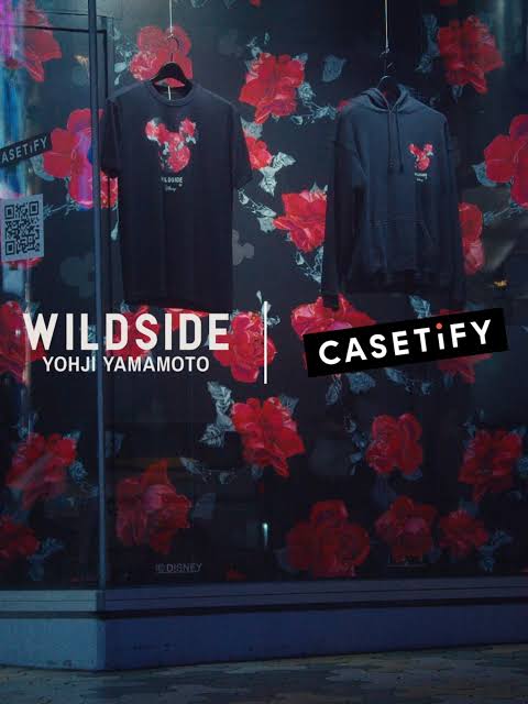
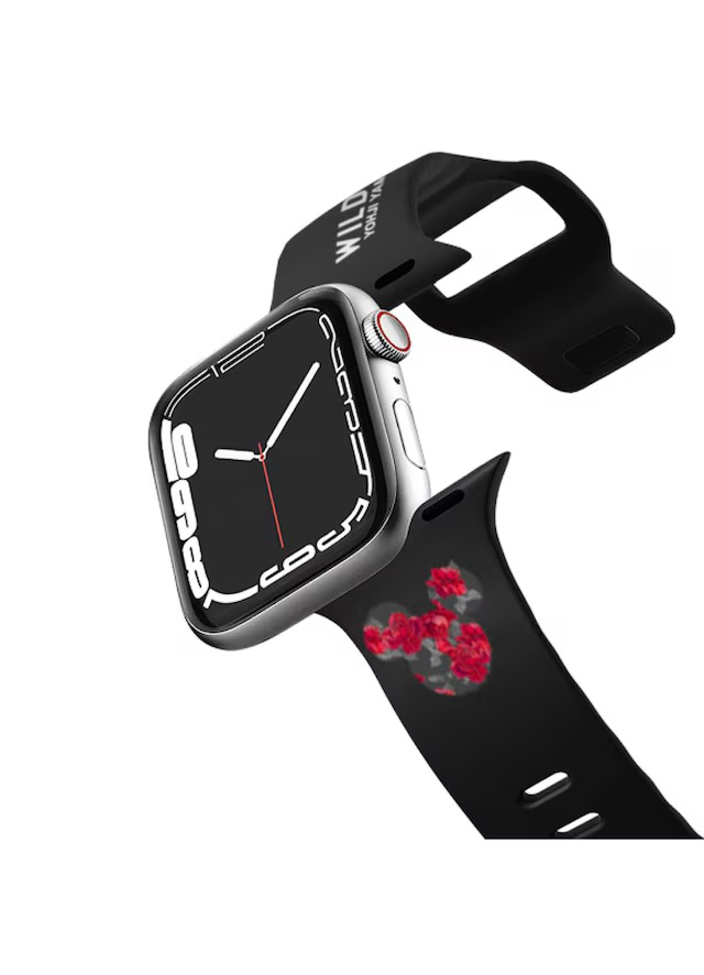
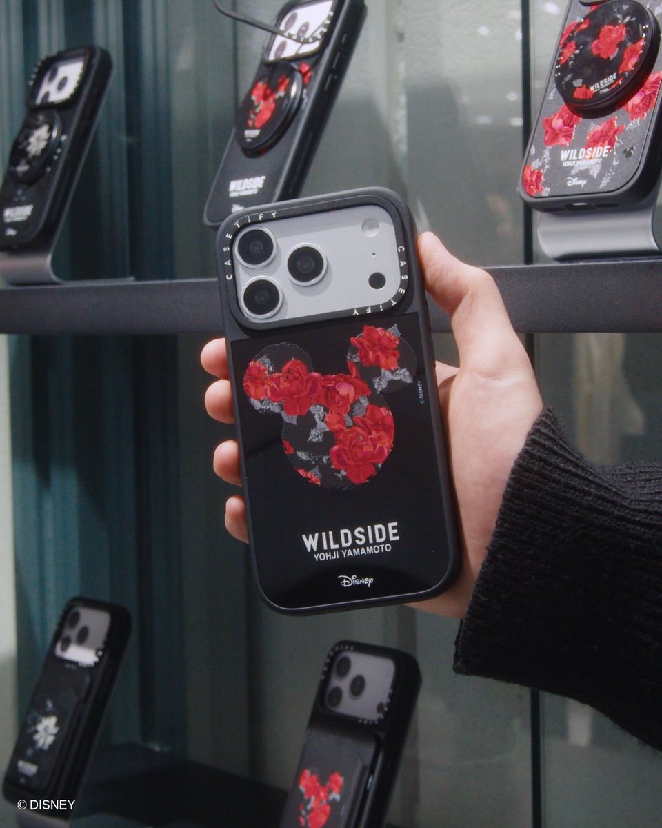
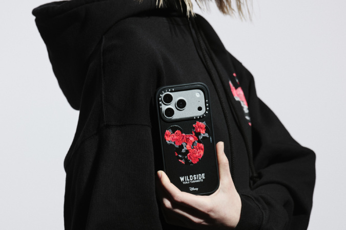
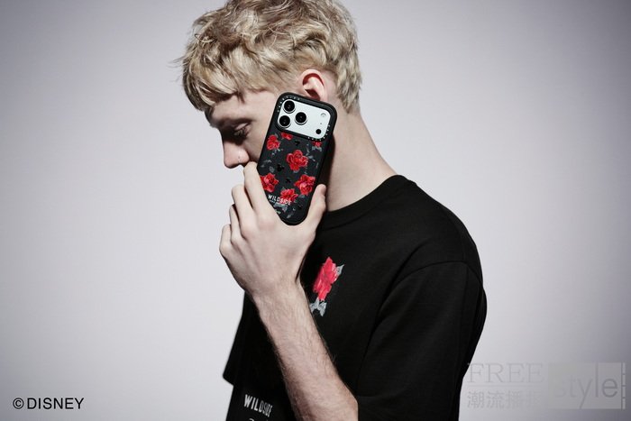
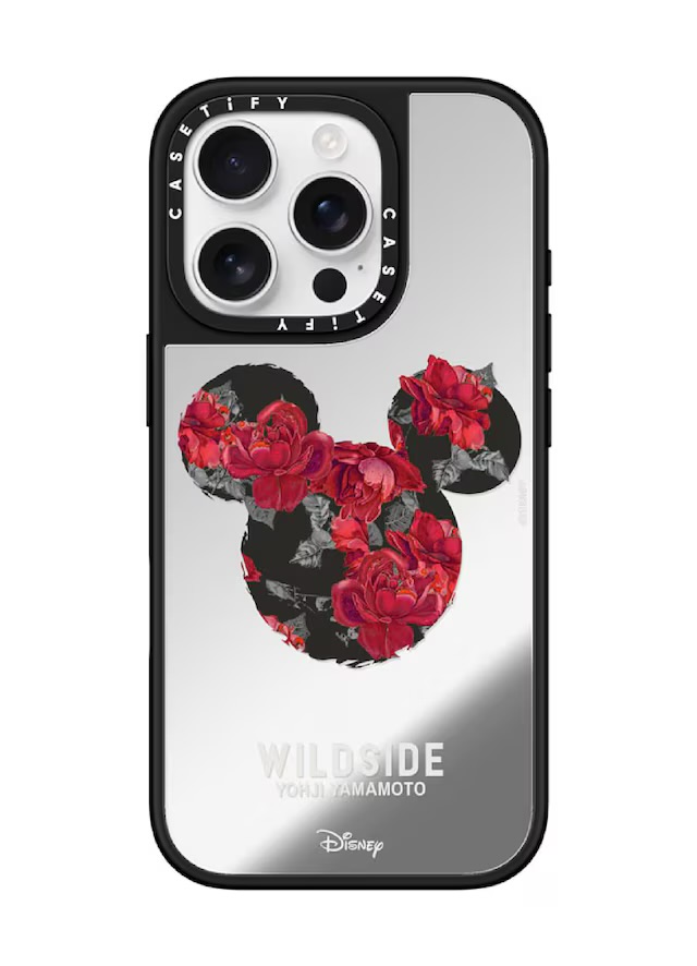
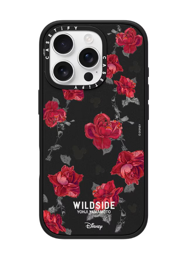
Legacy IP. New context.
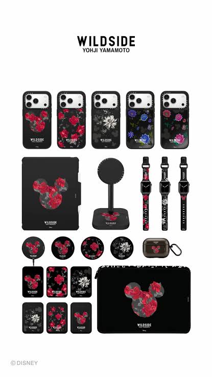
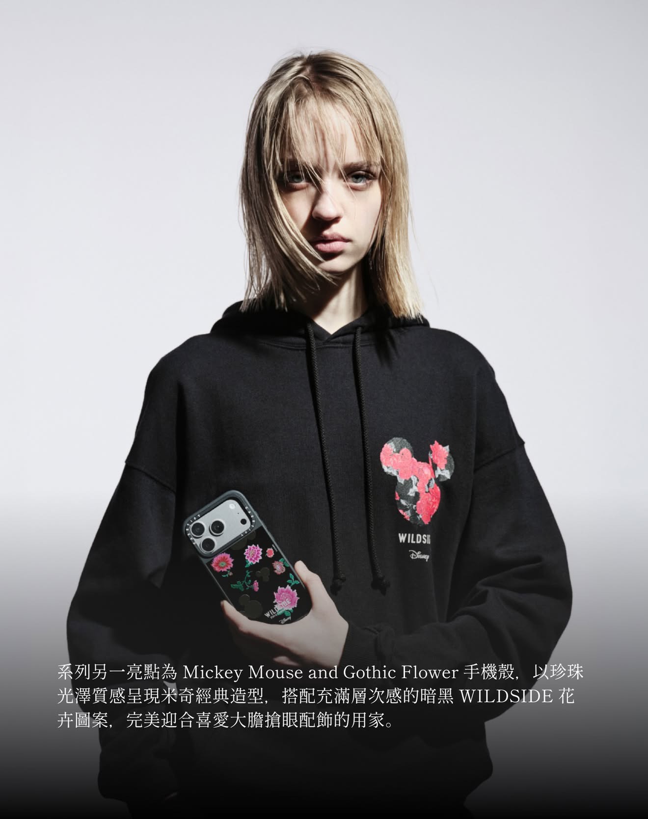
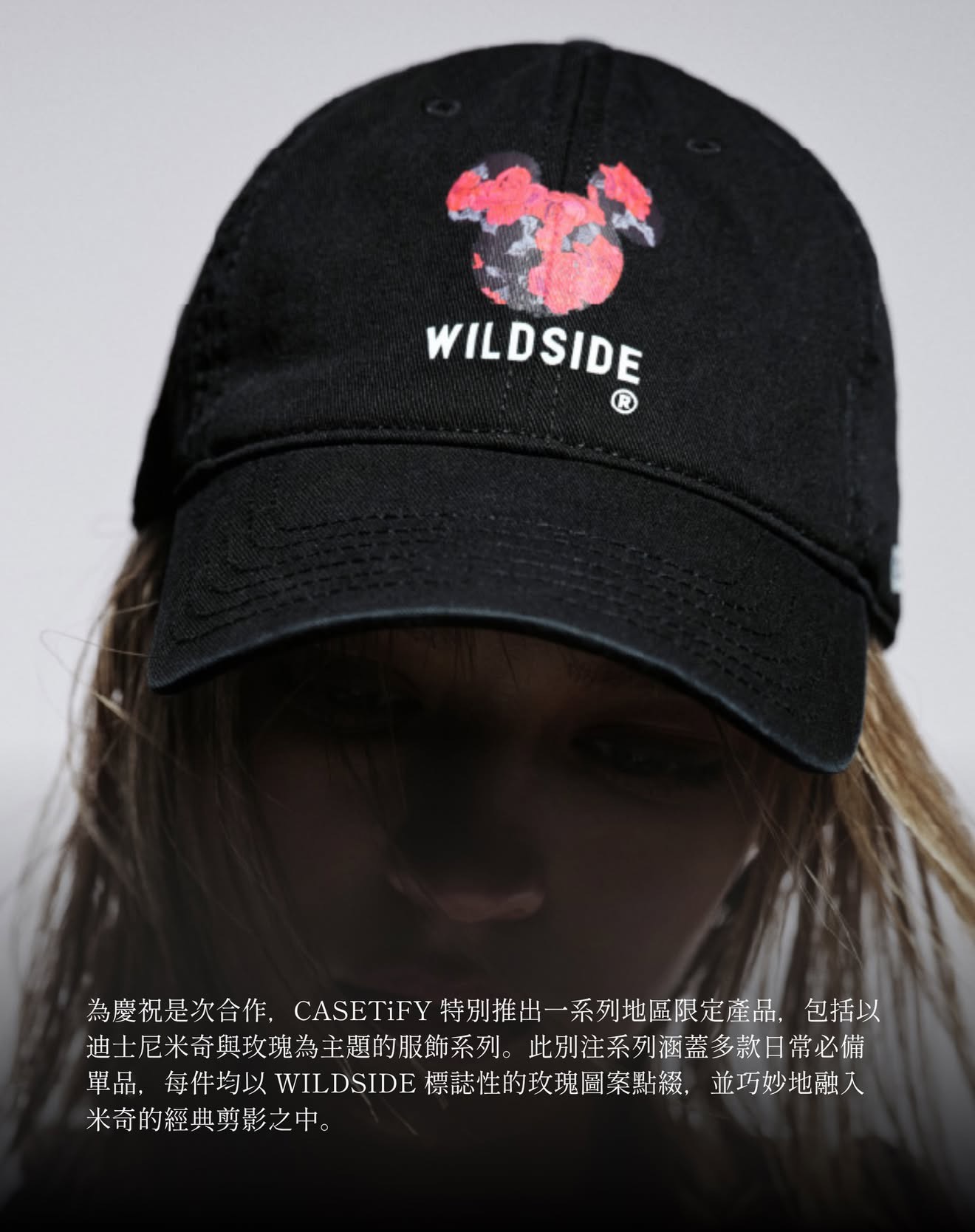
The final collection presented Mickey Mouse through a more directional and fashion-attuned lens, demonstrating how legacy character IP can be recontextualized for a contemporary collaboration audience without sacrificing integrity. The project was publicly positioned as CASETiFY's first-ever three-way collaboration — a distinctive crossover between fashion, collectible product, and iconic entertainment branding.

For the portfolio, this project represents more than a licensing success. It shows the ability to lead creative across soft cultural territory and hard product realities simultaneously: aligning brand guardianship, art direction, collaboration, and consumer product execution within a single visual world.

3

Brand collaboration
First of its kind for CASETiFY

Global

Distribution
CASETiFY retail ecosystem

1

Icon reinterpreted
Mickey through a fashion lens

← Back to Work

All Case Studies

Professional Work